Wine packaging is as important as choosing the right grapes for each bottle of wine. It must be informative and interesting enough to capture the buyer’s attention, in addition to looking grand and sophisticated.
Red wine is a complex and culture-laden experience inspired by everything showcased by its packaging, from the color of ambient down lighting to the combination of its contextual colors.
The choice of different themes and colors for each wine also has another benefit: branding. Setting a powerful brand for wine products helps consumers identify and recognize the wine without tasting it. The label created becomes a designated hierarchy to help your brand tell the tale.
Wine packaging boxes can improve customers’ desire to buy and purchase decisions. However, the label on the packaging box or red wine bottle is also an important element that customers pay attention to when purchasing red wine. Therefore, we should also focus on it when designing and customizing packaging labels.
1. Trophy
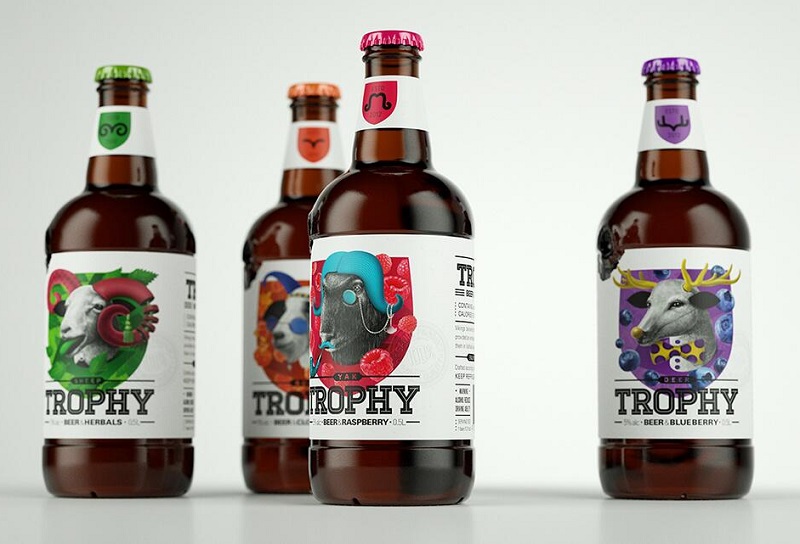 Pavla Chuykina is an Australian designer and illustrator, and one of her masterpieces is the Trophy concept fruit-flavored beer packaging. The history of the beer is closely related to the hunting culture and its main audience is relatively young, so Pavla Chuykina used pencil-drawn animal illustrations as the main graphics to reflect the hunting culture and incorporated fruits to represent the beer’s flavor formula. The overall packaging design has a unique visual aesthetic and is visually distinctive compared to similar products.
2. Small Talk Vineyards
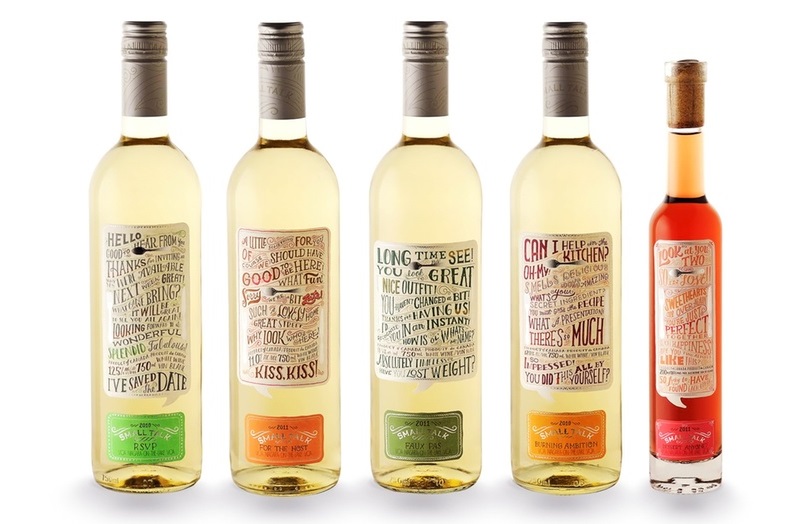 Small Talk Vineyards wine label is very creative and allows customers to start a conversation from the wine label. It is no exaggeration to say that these wine bottles are slowly being opened. Most of what is printed on them are simple questions and answers, such as: How is the weather? What good book have you read recently? It’s not just the text itself that is innovative and cool, the design itself is amazing, with the phrases that the labels focus on all printed in different sizes, very carnivalesque.
3. Solera Beverage
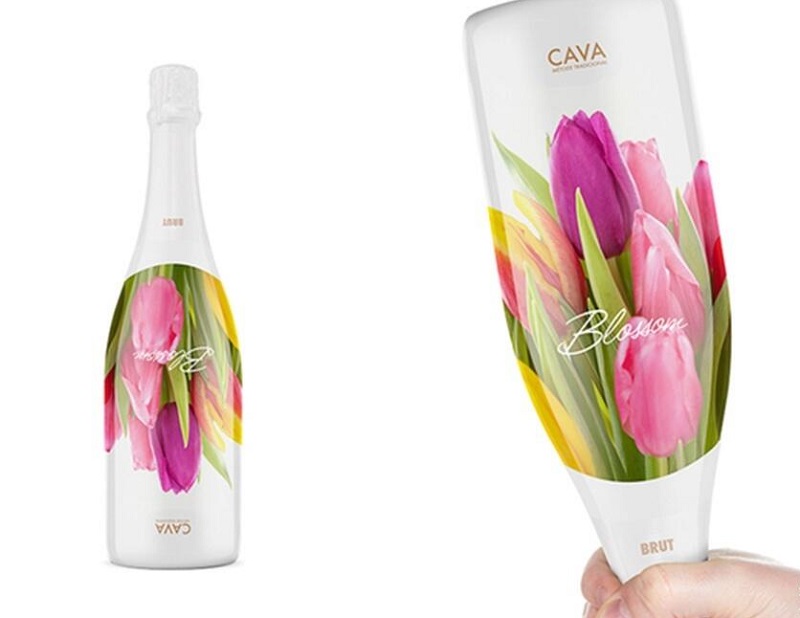 Solera Beverage Group is one of the largest beverage groups in Northern Europe, specializing in the import, marketing, sale and distribution of wine, spirits, beer and other alcoholic and non-alcoholic beverages. A number of years ago Solera Beverage Group approached the Norwegian packlab design team to design the packaging for one of its Cava sparkling wines. packlab’s clever and sophisticated approach was to start with the characteristic floral scent of the sparkling wine itself, and to think of why not make the bottle a bouquet of flowers. It is a bouquet of flowers, a bottle of wine, and a flower that connects the whole concept.
4. Broken Heart Gin
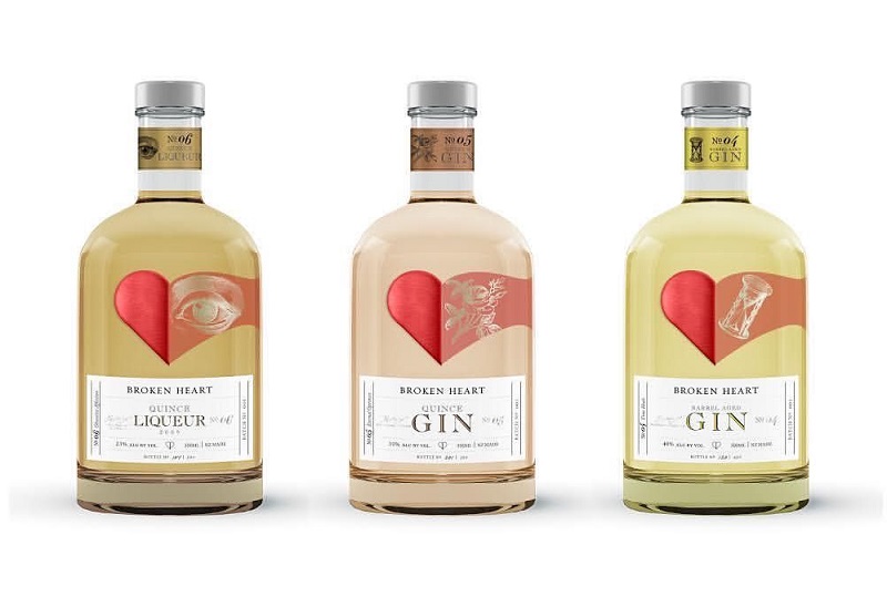 Broken Heart Spirits’ heart-shaped label adds a lot of creativity to the packaging. The heart-shaped image also conveys the fact that gin is good for the heart. Taking advantage of the spirits’ transparency, the heart-shaped image is split in two at the front and back of the bottle, visually appearing as if one half of the heart is slowly coming together with the other half.
5. Easy-Mixers
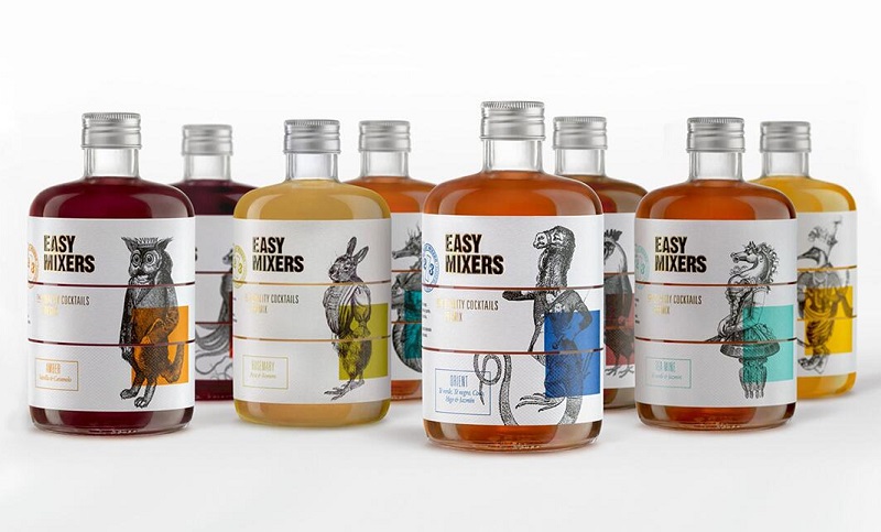 TSMGO is a famous design team from Spain, and one of its masterpieces is Easy-Mixers, whose bottle label design is based on the 2/3 rule of cocktails (two non-alcoholic and one alcoholic), dividing the bottle label into three separate parts and drawing the image of relay, which originated in the 1920s. The bottle label is divided into three separate parts and incorporates the 1920’s game of relay drawing (where the participants draw a part of the bottle without interfering with each other to create a unique picture) into the bottle label design, and each part of the bottle label presents a different illustration graphic, which in turn creates a unique illustration.
6. Heineken
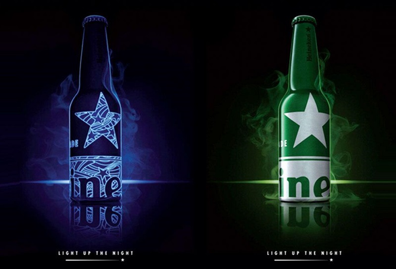 Heineken’s limited edition aluminum packaging design was created by Dutch design team dbod. The beer packaging design fully incorporates Heineken’s super visual design symbol, the star, and uses glow-in-the-dark ink technology to print this super visual symbol. It has a unique visual appeal and memorability.
7. Armand de Brignac
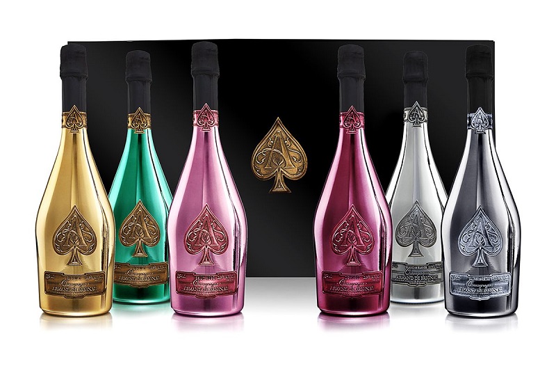 This is probably the most expensive wine in these cases. We can see it in the bottle of the wine and in the logo. The metal label of the wine can give the impression of being expensive and high status. Both the bottle and the metal label reveal the high end without fail.
Free design, free samples. If you need, please contact us.
 You Can Get the Best Prices By Calling: +86-189-3803-5880
 EMAIL: sophie@canfeicn.com
 ADDRESS: No.1204 Xiashuijing Building No.250 Jihua Road Longgang District Shenzhen City Guangdong Province China
1 thought on “Top 7 Wine Packaging Designs( Bottles & Labels)”